The Santander Product Recommendation data science competition where the goal was to predict which new banking products customers were most likely to buy has just ended. After my earlier success in the Facebook recruiting competition I decided to have another go at competitive machine learning by competing with over 2,000 participants. This time I finished 2nd out of 1785 teams! In this post, I’ll explain my approach.
Overview
This blog post will cover all sections to go from the raw data to the final submissions. Here’s an overview of the different sections. If you want to skip ahead, just click the section title to go there.
- Introduction
- Exploratory analysis
- Strategy
- Feature engineering
- Base models
- Base model combination
- Post-processing
- Ensembling
- Conclusion
The R source code is available on GitHub. This thread on the Kaggle forum discusses the solution on a higher level and is a good place to start if you participated in the challenge.
Introduction
From the competition page: Ready to make a downpayment on your first house? Or looking to leverage the equity in the home you have? To support needs for a range of financial decisions, Santander Bank offers a lending hand to their customers through personalized product recommendations.

Under their current system, a small number of Santander’s customers receive many recommendations while many others rarely see any resulting in an uneven customer experience. In their second competition, Santander is challenging Kagglers to predict which products their existing customers will use in the next month based on their past behavior and that of similar customers. With a more effective recommendation system in place, Santander can better meet the individual needs of all customers and ensure their satisfaction no matter where they are in life.
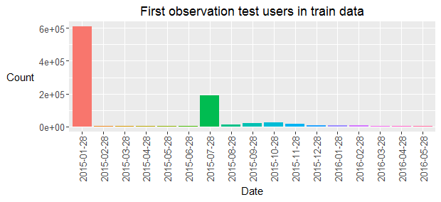
The training data consists of nearly 1 million users with monthly historical user and product data between January 2015 and May 2016. User data consists of 24 predictors including the age and income of the users. Product data consists of boolean flags for all 24 products and indicates whether the user owned the product in the respective months. The goal is to predict which new products the 929,615 test users are most likely to buy in June 2016. A product is considered new if it is owned in June 2016 but not in May 2016. The next plot shows that most users in the test data set were already present in the first month of the train data and that a relatively large share of test users contains the first training information in July 2015. Nearly all test users contain monthly data between their first appearance in the train data and the end of the training period (May 2016).
A ranked list of the top seven most likely new products is expected for all users in the test data. The leaderboard score is calculated using the MAP@7 criterion. The total score is the mean of the scores for all users. When no new products are bought, the MAP score is always zero and new products are only added for about 3.51% of the users. This means that the public score is only calculated on about 9800 users and that the perfect score is close to 0.035.
The test data is split randomly between the public and private leaderboard using a 30-70% random split. For those who are not familiar with Kaggle competitions: feedback is given during the competition on the public leaderboard whereas the private leaderboard is used to calculate the final standings.
Exploratory analysis
I wrote an interactive Shiny application to research the raw data. Feel free to explore the data yourself! This interactive analysis revealed many interesting patterns and was the major motivation for many of the base model features. The next plot shows the new product count in the training data for the top 9 products in the training months.
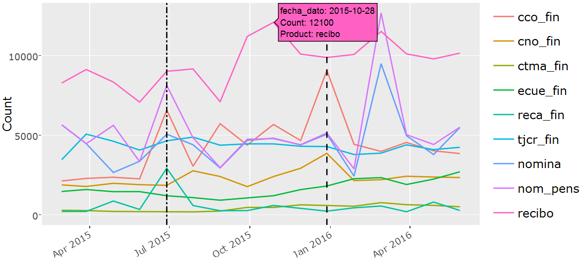
The popularity of products evolves over time but there are also yearly seasonal causes that impact the new product counts. June 2015 (left dotted line in the plot above) is especially interesting since it contains a quite different new product distribution (Cco_fin and Reca_fin in particular) compared to the other months, probably because June marks the end of the tax year in Spain. It will turn out later on in the analysis that the June 2015 new product information is by far the best indicator of new products in June 2016, especially because of divergent behavior in the tax product (Reca_fin) and the checking account (cco_fin). The most popular forum post suggests to restrict the modeling effort to new product records in June 2015 to predict June 2016. A crucial insight which changed the landscape of the competition after it was made public by one of the top competitors.
The interactive application also reveals that there is an important relation between the new product probability and the products that were owned in the previous month. The Nomina product is an extreme case: it is only bought if Nom_pens was owned in the previous month or if it is bought together with Nom_pens in the same month. Another interesting insight of the interactive application relates to the products that are frequently bought together. Cno_fin is frequently bought together with Nomina and Nom_pens. Most other new product purchases seem fairly independent. A final application of the interactive application shows the distribution of the continuous and categorical user predictors for users who bought new products in a specific month.
Strategy
A simplification of the overall strategy to generate a single submission is shown below. The final two submissions are ensembles of multiple single submissions with small variations in the base model combination and post-processing logic.
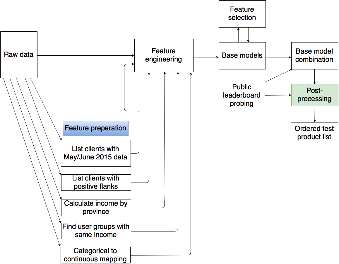
The core elements of my approach are the base models. These are all trained on a single month of data for all 24 products. Each base model consists of an xgboost model of the new product probability, conditional on the absence of the product in the previous month. The base models are trained using all available historical information. This can only be achieved by calculating separate feature files for all months between February 2015 and May 2016. The models trained on February 2015 only use a single lag month whereas the models trained on May 2016 use 16 lag months. Several feature preparation steps are required before the feature files can be generated. Restricting the base models to use only the top features for each lag-product pair speeds up the modeling and evaluation process. The ranked list of features is obtained by combining the feature gain ranks of the 5-fold cross validation on the base models trained using all features. The base model predictions on the test data are combined using a linear combination of the base model predictions. The weights are obtained using public leaderboard information and local validation on May 2016 as well as a correlation study of the base model predictions. Several post-processing steps are applied to the weighted product predictions before generating a ranked list of the most likely June 2016 new products for all test users.
Feature engineering
The feature engineering files are calculated using different lags. The models trained on June 2015 for example are trained on features based on all 24 user data predictors up till and including June 2015 and product information before June 2015. This approach mimics the test data which also contains user data for June 2016. The test features were generated using the most recent months and were based on lag data in order to have similar feature interpretations. Consequently, the model trained on June 2015 which uses 5 lag months is evaluated on the test features calculated on only the lag data starting in January 2016.
Features were added in several iterations. I added similar features based on those that had a strong predictive value in the base models. Most of the valuable features are present in the lag information of previously owned products. I added lagged features of all products at month lags 1 to 6 and 12 and included features of the number of months since the (second) last positive (new product) and negative (dropped product) flanks. The counts of the positive and negative flanks during the entire lag period were also added as features for all products as well as the number of positive/negative flanks for the combination of all products in lags 1 to 6 and 12. An interesting observation was the fact that the income (renta) was non-unique for about 30% of the user base where most duplicates occurred in pairs and groups of size < 10. I assumed that these represented people from the same household and that this information could result in valuable features since people in the same household might show related patterns. Sadly, all the family related features I tried added little value.
I added a boolean flag for users that had data in May 2015 and June 2015 as users that were added after July 2015 showed different purchasing behavior. These features however added little value since the base models were already able to capture this different behavior using the other features. The raw data was always used in its raw form except for the income feature. Here I used the median for the province if it was missing and I also added a flag to indicate that the value was imputed. Categorical features were mapped to numeric features using an intuitive manual reordering for ordinal data and a dummy ordering for nominal data.
Other features were added to incorporate dynamic information in the lag period of the 24 user data predictors. Many of these predictors are however static and added limited value to the overall performance. It would be great to study the impact of changing income on the product purchasing behavior but that was not possible given the static income values in the given data set. I did not include interactions between the most important features and wish that I had after reading the approaches of several of the other top competitors.
Base models
The base models are binary xgboost models for all 24 products and all 16 months that showed positive flanks (February 2015 - May 2016). My main insight here was to use all the available data. This means that the models are trained on all users that did not contain the specific products in the previous months. Initially I was using a “marginal” model to calculate the probability of any positive flank and a “conditional” model to calculate the probability of a product positive flank given at least one positive flank. This results in a way faster fitting process since only about 3 to 4 percent of the users buys at least one product in a specific month but I found that I got slightly better results when modeling using all the data (the “joint” model).
The hyperparameters were decided based on the number of training positive flanks, the more positive flanks I observed in the train data, the deeper the trees.
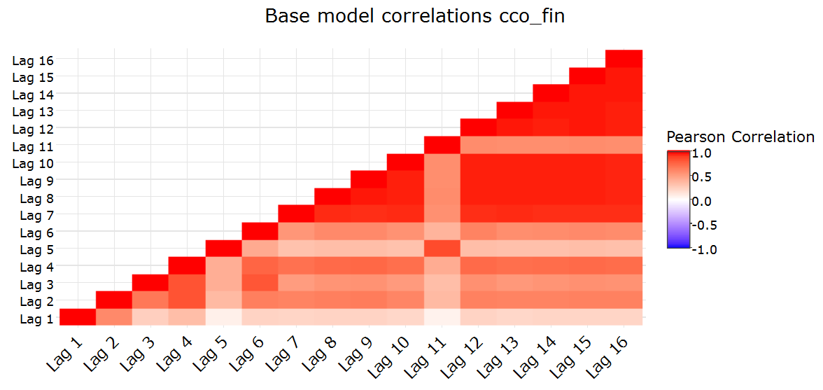
All models were built using all the train data as well as the remaining data after excluding 10 mutually exclusive random folds. I tried several ways to stack the base model predictions but it seemed that the pattern differences were too variable over time for the value of stacking to kick in compared to a weighted average of the base model predictions.
I also tried to bootstrap the base models but this gave results that were consistently worse. To my current knowledge none of the top competitors got bootstrapping to work in this problem setting.
Base model combination
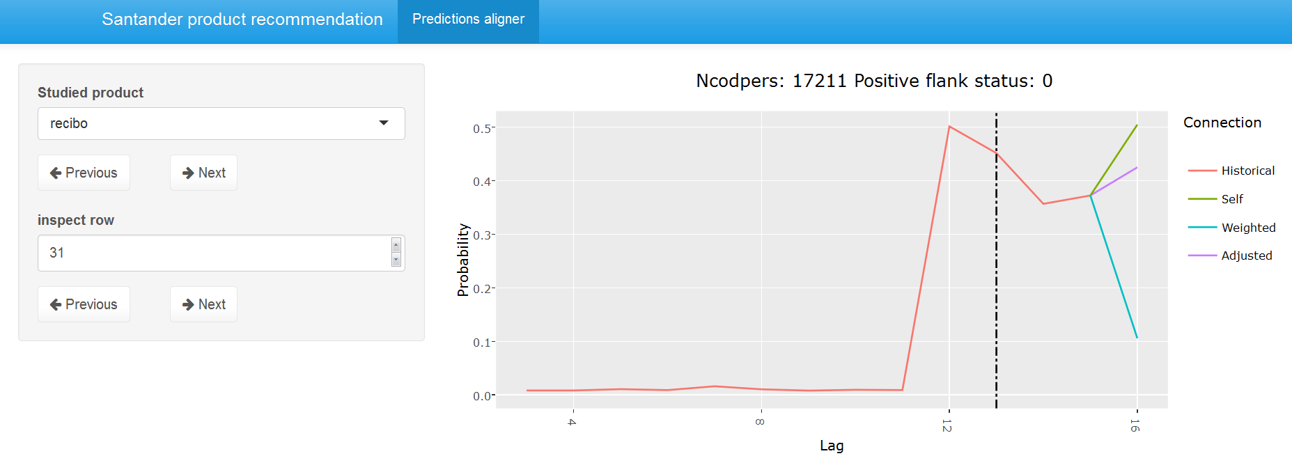
The base models from the previous section were fit to the test data where the number of used test lags was set to the number of lags in the train data. Most weight was given to June 15 but other months all contained valuable information too although I sometimes set the weight to zero for products where the patterns changed over time (end of this section). To find a good way to combine the base models it was a good idea to look at the data interactively. The second interactive Shiny application compares the base model predictions on the test set for the most important products and also shows other base model related information such as the confidence in the predictions. The following two screenshots give an impression of the application but here I would again like to invite you to have a look at the data interactively.
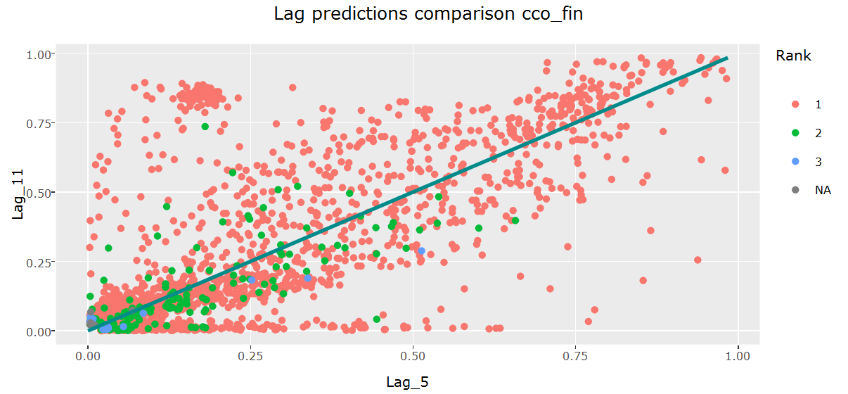
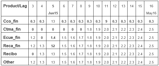
The interactive base model prediction application made me think of various ways to combine the base model predictions. I tried several weighted transformations but could not find a transformation that consistently worked better with respect to the target criterion than a simple weighted average of the base model predictions. Different weights were used for different products based on the interactive analysis and public leaderboard feedback. The weights of ctma_fin were for example set to 0 prior to October 2015 since the purchasing behavior seemed to obey to different rules prior to that date. Cco_fin showed particularly different behavior in June and December 2015 compared to other months and it seemed like a mixed distribution of typical cco_fin patterns and end of (tax) year specific patterns in those months. The table below shows the relative lag weights for all products. These are all normalized so that they sum to 1 for each product but are easier to interpret in their raw shape below. More recent months typically contribute more since they can model richer dynamics and most weight is given to June 2015. The weights for lags 1 (February 2015) and 2 (March 2015) are set to 0 for all products.
Some product positive flanks such as nomina and nom_pens mostly rely on information from the previous lag but product positive flanks like recibo get more confident when more lag information is available. Let’s say for example that recibo was dropped in October 2015 and picked up in November 2015. The June 2015 model would not be able to use this information since only 5 test lag months are used to evaluate the model on the test set (January 2016 - May 2016). In these cases, I adjusted the probability to the probabilities of the models that use more data in some of my submissions. In hindsight, I wish that I had applied it to all submissions. The next plot compares the weighted prediction for May 2016 using the weights from the table above with the adjusted predictions that only incorporate a subset of the lags. The adjusted (purple) predictions are way closer to the predictions using the out-of-bag May 2016 model compared to the weighted approach that uses all base lags and can thus be considered preferable for the studied user.
Post-processing
Product probability normalization The test probabilities are transformed by elevating them to an exponent such that the sum of the product probabilities matches the extrapolated public leaderboard count. An exponential transformation has the benefit over a linear transformation that it mostly affects low probabilities. Here it was important to realize that the probed public leaderboard scores don’t translate directly into positive leaderboard counts. Products like nomina which are frequently bought together with nom_pens and cno_fin to less extent are thus more probable than their relative MAP contribution.
Confidence incorporation Through a simulation study I could confirm my suspicion that in order to optimize the expected MAP, less confident predictions should be shrunk with respect to more confident predictions. I applied this in some of my submissions and this added limited but significant value to the final ensembles. I calculated confidence as mean(prediction given actual positive flank)/mean(prediction given no positive flank) where prediction was calculated on the out of fold records in the 10-fold cross validation of the base models.
Nomina Nom_pens reordering Nomina is never bought without nom_pens if nom_pens was not owned in the previous month. I simply swapped their predicted probabilities if nomina was ever ranked above nom_pens and if both were not owned in the previous month.
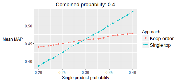
MAP optimization Imagine this situation: cco_fin has a positive flank probability of 0.3 and nomina and nom_pens both have a probability of 0.4 but they always share the same value. All other product probabilities are assumed to be zero. Which one should you rank on top in this situation? cco! The following plot shows a simulation study of the expected MAP where the combined (nomina and nom_pens) probability is set to 0.4 and the single (cco_fin) probability varies between 0.2 and 0.4. The plot agrees with the mathematical derivation which concludes that cco_fin should be ranked as the top product to maximize the expected MAP if its probability is above 0.294. I also closed “gaps” between nomina and nom_pens when the relative probability difference was limited. This MAP optimization had great effects in local validation (~0.2% boost) but limited value on the public leaderboard. It turns out that the effect on the private leaderboard had similar positive value but that I was overfitting, leading me to conclude falsely that MAP optimization had limited value overall.
Ensembling
I submitted two ensembles: one using my last 26 submissions where the weighted probability was calculated with the weights based on the correlation with the other submissions and the public leaderboard score. The second ensemble consisted of a manual selection of 4 of these 26 submissions that were again selected and weighted using their correlation with other submissions and public leaderboard feedback. Details of my submissions are available on GitHub. The next plot shows the public leaderboard score for all final 26 submissions versus the mean mutual rank correlation. I selected the manual subset using this graph and the rank correlation of the submissions in order to make the submissions as uncorrelated as possible while still obtaining good public leaderboard feedback.
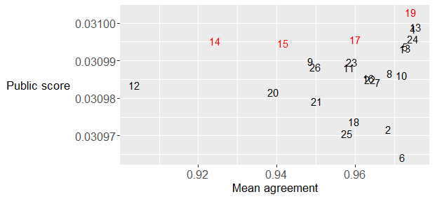
I only got to ensembling on the last day of the competition and only discovered after the deadline that rank averaging typically works better than probability averaging. The main reason is probably the nature of the variations I included in my final submissions since most variations were in the post-processing steps.
Conclusion
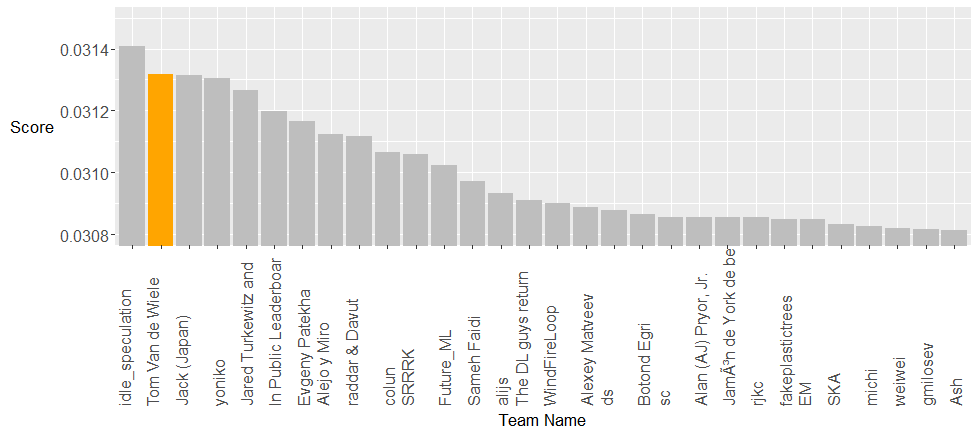
The private leaderboard standing below, used to rank the teams, shows the top 30 teams. It was a very close competition on the public leaderboard between the top three teams but idle_speculation was able to generalize better making him a well-deserved winner of the competition. I am very happy with the second spot, especially given the difference between second, third and fourth, but I would be lying if I said that I hadn’t hoped for more for a long time. There was a large gap between first and second for several weeks but this competition lasted a couple of days too long for me to secure the top seat. I managed to make great progress during my first 10 days and could only achieve minor improvements during the last four weeks. Being on top for such a long time tempted me to make small incremental changes where I would only keep those changes if they improved my public score. With a 30-70% public/private leaderboard split this approach is prone to overfitting and in hindsight I wish that I had put more trust in my local validation. Applying trend detection and MAP optimization steps in all submissions would have improved my final score to about 0.03136 but idle_speculation would still have won the contest. I was impressed by the insights of many of the top competitors. You can read more about their approaches on the Kaggle forum.
Running all steps on my 48GB workstation would take about a week. Generating a ~0.031 private leaderboard score (good for 11th place) could however be achieved in about 90 minutes by focusing on the most important base model features using my feature ranking and only using one model for each product-lag combination. I would suggest to consider only the top 10 features in the base model generation and omit the folds from the model generation if you are mostly interested in the approach rather than the result.
I really enjoyed working on this competition although I didn’t compete as passionately as I did in the Facebook competition. The funny thing is that I would never have participated had I not quit my pilgrimage on the famous Spanish “Camino del Norte” because of food poisoning in… Santander. I initially considered the Santander competition as a great way to keep busy whereas I saw the Facebook competition as a way to change my professional career. Being ahead for a long time also made me a little complacent but the final days on this competition brought back the great feeling of close competition. The numerous challenges at Google DeepMind will probably keep me away from Kaggle for a while but I hope to compete again in a couple of years with a greater toolbox!
I look forward to your comments and suggestions.