The Facebook V: Predicting Check Ins data science competition where the goal was to predict which place a person would like to check in to has just ended. I participated with the goal of learning as much as possible and maybe aim for a top 10% since this was my first serious Kaggle competition attempt. I managed to exceed all expectations and finished 1st out of 1212 participants! In this post, I’ll explain my approach.
Overview
This blog post will cover all sections to go from the raw data to the winning submission. Here’s an overview of the different sections. If you want to skip ahead, just click the section title to go there.
- Introduction
- Exploratory analysis
- Problem definition
- Strategy
- Candidate selection 1
- Feature engineering
- Candidate selection 2
- First level learners
- Second level learners
- Conclusion
The R source code is available on GitHub. This thread on the Kaggle forum discusses the solution on a higher level and is a good place to start if you participated in the challenge.
Introduction

From the competition page: The goal of this competition is to predict which place a person would like to check in to. For the purposes of this competition, Facebook created an artificial world consisting of more than 100,000 places located in a 10 km by 10 km square. For a given set of coordinates, your task is to return a ranked list of the most likely places. Data was fabricated to resemble location signals coming from mobile devices, giving you a flavor of what it takes to work with real data complicated by inaccurate and noisy values. Inconsistent and erroneous location data can disrupt experience for services like Facebook Check In.
The training data consists of approximately 29 million observations where the location (x, y), accuracy, and timestamp is given along with the target variable, the check in location. The test data contains 8.6 million observations where the check in location should be predicted based on the location, accuracy and timestamp. The train and test data set are split based on time. There is no concept of a person in this dataset. All the observations are events, not people.
A ranked list of the top three most likely places is expected for all test records. The leaderboard score is calculated using the MAP@3 criterion. Consequently, ranking the actual place as the most likely candidate gets a score of 1, ranking the actual place as the second most likely gets a score of 1/2 and a third rank of the actual place results in a score of 1/3. If the actual place is not in the top three of ranked places, a score of 0 is awarded for that record. The total score is the mean of the observation scores.

Exploratory analysis
Location analysis of the train check ins revealed interesting patterns between the variation in x and y. There appears to be way more variation in x than in y. It was suggested that this could be related to the streets of the simulated world. The difference in variation between x and y is however different for all places and there is no obvious spatial (x-y) pattern in this relationship.
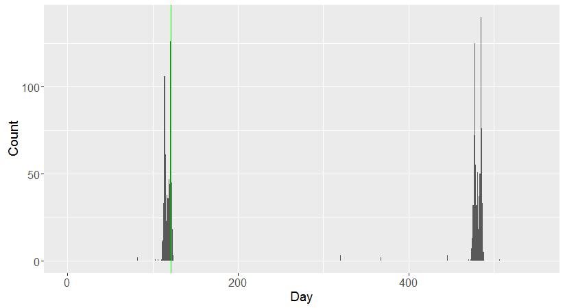
It was quickly established by the community that time is measured in minutes and could thus be converted to relative hours and days of the week. This means that the train data covers 546 days and the test data spans 153 days. All places seem to live in independent time zones with clear hourly and daily patterns. No spatial pattern was found with respect to the time patterns. There are however two clear dips in the number of check ins during the train period.
Accuracy was by far the hardest input to interpret. It was expected that it would be clearly correlated with the variation in x and y but the pattern is not as obvious. Halfway through the competition I cracked the code and the details will be discussed in the Feature engineering section.
I wrote an interactive Shiny application to research these interactions for a subset of the places. Feel free to explore the data yourself!
Problem definition
The main difficulty of this problem is the extended number of classes (places). With 8.6 million test records there are about a trillion (10^12) place-observation combinations. Luckily, most of the classes have a very low conditional probability given the data (x, y, time and accuracy). The major strategy on the forum to reduce the complexity consisted of calculating a separate classifier for many x-y rectangular grids. It makes much sense to make use of the spatial information since this shows the most obvious and strong pattern for the different places. This approach makes the complexity manageable but is likely to lose a significant amount of information since the data is so variable. I decided to model the problem with a single binary classification model in order to avoid to end up with many high variance models. The lack of any major spatial patterns in the exploratory analysis supports this approach.
Strategy
Generating a single classifier for all place-observation combinations would be unpractical, even with a powerful cluster. My approach consists of a stepwise strategy in which the conditional place probability is only modeled for a set of place candidates. A simplification of the overall strategy is shown below

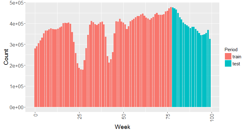
The given raw train data is split in two chronological parts, with a similar ratio as the ratio between the train and test data. The summary period contains all given train observations of the first 408 days (minutes 0-587158). The second part of the given train data contains the next 138 days and will be referred to as the train/validation data from now on. The test data spans 153 days as mentioned before.
The summary period is used to generate train and validation features and the given train data is used to generate the same features for the test data.
The three raw data groups (train, validation and test) are first sampled down into batches that are as large as possible but can still be modeled with the available memory. I ended up using batches of approximately 30,000 observations on a 48GB workstation. The sampling process is fully random and results in train/validation batches that span the entire 138 days’ train range.
Next, a set of models is built to reduce the number of candidates to 20 using 15 XGBoost models in the second candidate selection step. The conditional probability P(place_match|features) is modeled for all ~30,000*100 place-observation combinations and the mean predicted probability of the 15 models is used to select the top 20 candidates for each observation. These models use features that combine place and observation measures of the summary period.
The same features are used to generate the first level learners. Each of the 100 first level learners are again XGBoost models that are built using ~30,000*20 feature-place_match pairs. The predicted probabilities P(place_match|features) are used as features of the second level learners along with 21 manually selected features. The candidates are ordered using the mean predicted probabilities of the 30 second level XGBoost learners.
All models are built using different train batches. Local validation is used to tune the model hyperparameters.
Candidate selection 1
The first candidate selection step reduces the number of potential classes from >100K to 100 by considering nearest neighbors of the observations. I considered the neighbor counts of the 2500 nearest neighbors where y variations are 2.5 times more important than x variations. Ties in the neighbor counts are resolved by the mean time difference since the observations. Resolving ties with the mean time difference is motivated by the shifts in popularity of the places.
The nearest neighbor counts are calculated efficiently by splitting up the data in overlapping rectangular grids. Grids are created as small as possible while still guaranteeing that the 2500 nearest neighbors fall within the grid in the worst case scenario. The R code is suboptimal through the use of several loops but the major bottleneck (ordering the distances) was reduced by a custom Rcpp package which resulted in an approximate 50% speed up. Improving the logic further was no major priority since the features were calculated on the background.
Feature engineering
Feature engineering strategy
Three weeks into the eight-week competition, I climbed to the top of the public leaderboard with about 50 features. Ever since I kept thinking of new features to capture the underlying patterns of the data. I also added features that are similar to the most important features in order to capture the subtler patterns. The final model contains 430 numeric features and this section is intended to discuss the majority of them.
There are two types of features. The first category relates to features that are calculated using only the summary data such as the number of historical check ins. The second and largest category combines summary data of the place candidates with the observation data. One such example is the historical density of a place candidate, one year prior to the observation.
All features are rescaled if needed in order to result in similar interpretations for the train and test features.
Location
The major share of my 430 features is based on nearest neighbor related features. The neighbor counts for different Ks (1, 5, 10, 20, 50, 100, 250, 500, 1000 and 2500) and different x-y ratio constants (1, 2.5, 4, 5.5, 7, 12 and 30) resulted in 10*7 features. For example: if a test observation has 3 of its 5 nearest neighbors of class A and 2 of its 5 nearest neighbors as class B, the candidate A will contain the numeric value of 3 for the K=5 feature, the candidate B will contain the numeric value of 2 for the K=5 feature and all other 18 candidates will contain the value of 0 for that feature. The mean time difference between a candidate and all 70 combinations resulted in 70 additional features. 10 more features were added by considering the distance between the Kth features and the observations for a ratio constant of 2.5. These features are an indication of the spatial density. 40 more features were added in a later iteration around the most significant nearest neighbor features. K was set at (35, 75, 100, 175, 375) for x-y ratio constants (0.4, 0.8, 1.3, 2, 3.2, 4.5, 6 and 8). The distances of all 40 combinations to the most distant neighbor were also added as features. Distance features are divided by the number of summary observations in order to have similar interpretations for the train and test features.
I further added several features that consider the (smoothed) spatial grid densities. Other location features relate to the place summaries such as the median absolute deviations and standard deviations in x and y. The ratio between the median absolute deviations was added as well. Features were relaxed using additive (Laplace) smoothing with different relaxation constants whenever it made sense using the relaxation constants 20 and 300. Consequently, the relaxed mad for a place with 300 summary observation is equal to the mean of the place mad and the weighted place population mad for a relaxation constant of 300.
Time
The second largest share of the features set belongs to time features. Here I converted all time period counts to period density counts in order to handle the two drops in the time frequency. Periods include 27 two-week periods prior to the end of the summary data and 27 1-week periods prior to the end of the summary data. I also included features that look at the two-week densities looking back between 75 and 1 weeks from the observations. These features resulted in missing values but XGBoost is able to handle them. Additional features were added for the clear yearly pattern of some places.
Hour, day and week features were calculated using the historical densities with and without cyclical smoothing and with or without relaxation. I suspected an interaction between the hour of the day and the day of the week and also added cyclical hour-day features. Features were added for daily 15-minute intervals as well. The cyclical smoothing is applied with Gaussian windows. The windows were chosen such that the smoothed hour, hour-week and 15-minute blocks capture different frequencies.
Other time features include extrapolated weekly densities using various time series models (arima, Holt-Winters and exponential smoothing). Further, the time since the end of the summary period was also added as well as the time between the end of the summary period and the last check in.
Accuracy
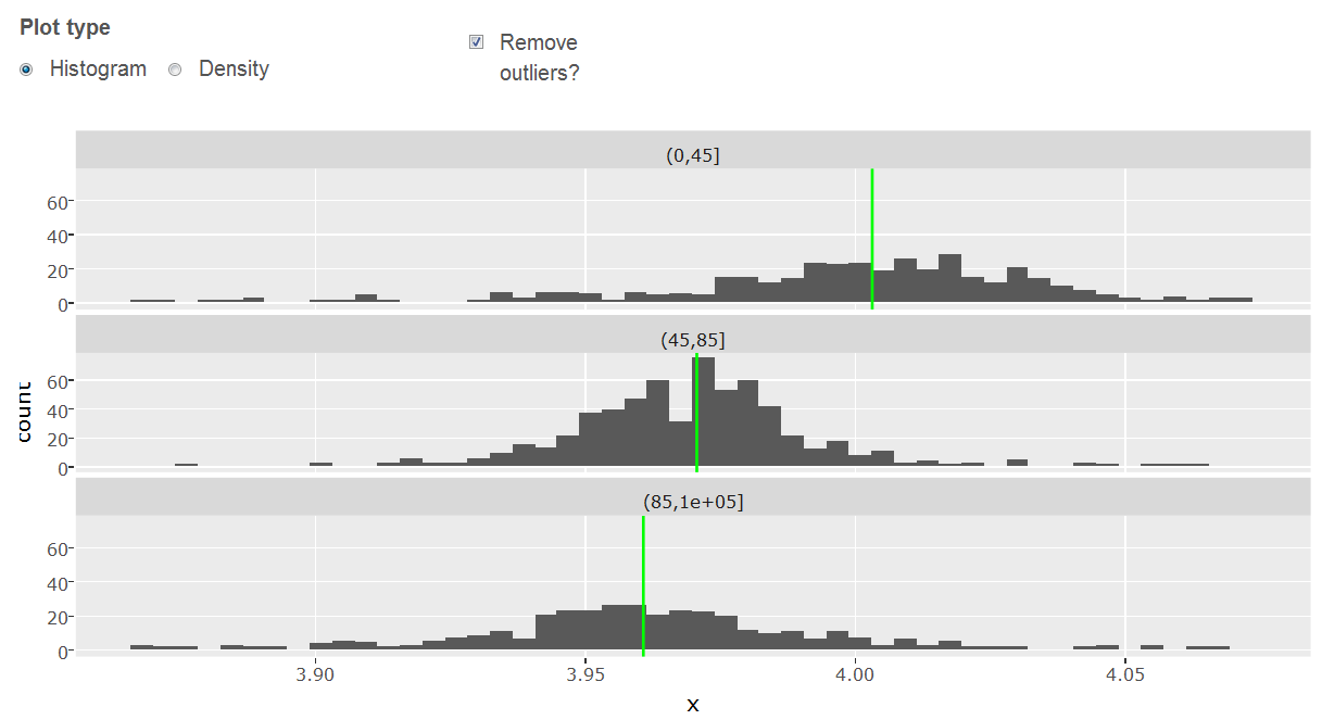
Understanding accuracy was the result of generating many plots. There is a significant but low correlation between accuracy and the variation in x and y but it is not until accuracy is binned in approximately equal sizes that the signal becomes visible. The signal is more accurate for accuracies in the 45-84 range (GPS data?).
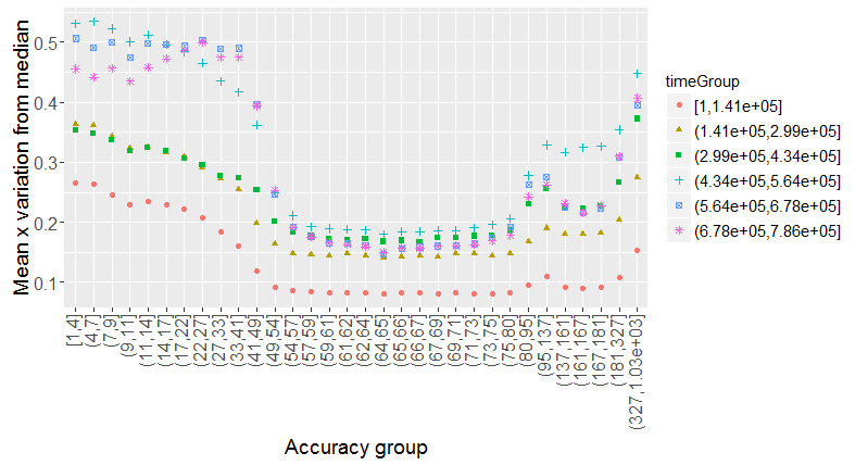
The accuracy distribution seems to be a mixed distribution with three peaks which changes over time. It is likely to be related to three different mobile connection types (GPS, Wi-Fi or cellular). The places show different accuracy patterns and features were added to indicate the relative accuracy group densities. The middle accuracy group was set to the 45-84 range. I added relative place densities for 3 and 32 approximately equally sized accuracy bins. It was also discovered that the location is related to the three accuracy groups for many places. This pattern was captured by the addition of additional features for the different accuracy groups. A natural extension to the nearest neighbor calculation would incorporate the accuracy group but I did no longer have time to implement it.
Z-scores
Tens of z scores were added to indicate how similar a new observation is to the historical patterns in the place candidates. Robust Z-scores ((f-median(f))/mad(f) instead of (f-mean(f))/sd(f)) gave the best results.
Most important features
Nearest neighbors are the most important features for the studied models. The most significant nearest neighbor features appear around K=100 for distance constant ratios around 2.5. Hourly and daily densities were all found to be very important as well and the highest feature ranks are obtained after smoothing. Relative densities of the three accuracy groups also appear near the top of the most important features. An interesting feature that also appears at the top of the list relates to the daily density 52 weeks prior to the check in. There is a clear yearly pattern which is most obvious for places with the highest daily counts.
The feature files are about 800MB for each batch and I saved all the features to an external HD.
Candidate selection 2
The features from the previous section are used to generate binary classification models on 15 different train batches using XGBoost models. With 100 candidates for each observation, this is a slow process and it made sense to me to narrow down the number of candidates to 20 at this stage. I did not perform any downsampling in my final approach since all zeros (not a match between the candidate and true match) contain valuable information. XGBoost is able to handle unbalanced data quite well in my experience. I did however consider to omit observations that didn’t contain the true class in the top 100 but this resulted in slightly worse validation scores. The reasoning is the same as above: those values contain valuable information! The 15 candidate selection models are built with the top 142 features. The feature importance order is obtained by considering the XGBoost feature importance ranks of 20 models trained on different batches. Hyperparameters were selected using the local validation batches. The 15 second candidate selection models all generate a predicted probability of P(place_match|data), I average those to select the top 20 candidates in the second candidate selection step.
At this point I also dropped observations that belong to places that only have observations in the train/validation period. This filtering was also applied to the test set.
First level learners
The first level learners are very similar to the second candidate selection models other than the fact that they were fit on one fifth of the data for 75 of the 100 models. The other 25 models were fit on 100 candidates for each observation. The 100 base XGBoost learners were fit on different random parts of the training period. Deep trees gave me the best results here (depth 11) and the eta constant was set to (11 or 12)/500 for 500 rounds. Column sampling also helped (0.6) and subsampling the observations (0.5) did not hurt but of course resulted in a fitting speed increase. I included either all 430 features or a uniform random pick of the ordered features by importance in a desirable feature count range (100-285 and 180-240). The first level learner framework was created to handle multiple first level learner types other than XGBoost. I experimented with the nnet and H2O neural network implementations but those were either too slow in transferring the data (H2O) or too biased (nnet). The way XGBoost handles missing values is another great advantage over the mentioned neural network implementations. Also, the XGBoost models are quite variable since they are trained on different random train batches with differing hyperparameters (eta constant, number of features and the number of considered candidates (either 20 or 100)).
Second level learners
The 30 second level learners combine the predictions of the 100 first level models along with 21 manually selected features for all top 20 candidates. The 21 additional features are high level features such as the x, y and accuracy values as well as the time since the end of the summary period. The added value of the 21 features is very low but constant on the validation set and the public leaderboard (~0.02%). The best local validation score was obtained by considering moderate tree depths (depth 7) and the eta constant was set to 8/200 for 200 rounds. Column sampling also helped (0.6) and subsampling the observations (0.5) did not hurt but again resulted in a fitting speed increase. The candidates are ordered using the mean predicted probabilities of the 30 second level XGBoost learners.
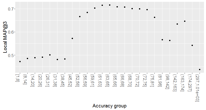
Analysis of the local MAP@3 indicated better results for accuracies in the 45-84 range. The difference between local and test validation scores is in large part related to this observation. There seems to be a trend towards the use of devices that show less spatial variation.
Conclusion
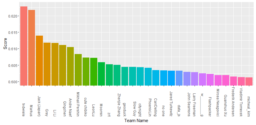
The private leaderboard standing below, used to rank the teams, shows the top 30 teams. It was a very close competition in the end and Markus would have been a well-deserved winner as well. We were very close to each other ever since the third week of the eight-week contest and pushed each other forward. The fact that the test data contains 8.6 million records and that it was split randomly for the private and public leaderboard resulted in a very confident estimate of the private standing given the public leaderboard. I was most impressed by the approaches of Markus and Jack (Japan) who finished in third position. You can read more about their approaches on the forum. Many others also contributed valuable insights.
I started the competition using a modest 8GB laptop but decided to purchase a €1500 workstation two weeks into the competition to speed up the modeling. Starting with limited resources ended up to be an advantage since it forced me to think of ways to optimize the feature generation logic. My best friend during this competition was the data.table package.
Running all steps on my 48GB workstation would take about a month. That seems like a ridiculously long time but it is explained by the extended computation time of the nearest neighbor features. While calculating the NN features I was continuously working on other parts of the workflow so speeding the NN logic up would not have resulted in a better final score.
Generating a ~.62 score could however be achieved in about two weeks by focusing on the most relevant NN features. I would suggest to consider 3 of the 7 distance constants (1, 2.5 and 4) and omit the mid KNN features. Cutting the first level models from 100 to 10 and the second level models from 30 to 5 would also not result in a strong performance decrease (estimated decrease of 0.1%) and cut the computation time to less than a week. You could of course run the logic on multiple instances and further speed things up.
I really enjoyed working on this competition even though it was already one of the busiest periods of my life. The competition was launched while I was in the middle of writing my Master’s Thesis in statistics in combination with a full time job. The data shows many interesting noisy and time dependent patterns which motivated me to play with the data before and after work. It was definitely worth every second of my time! I was inspired by the work of other Kaggle winners and successfully implemented my first two level model. Winning the competition is a nice extra but it’s even better to have learnt a lot from the other competitors, thank you all!
I look forward to your comments and suggestions.